この投稿は最終更新から2年以上経過しているため、内容が古くなっている可能性があります。
憧れのタイムライン
タイムラインってやつを前から使ってみたかったんです。
Cocoonに標準装備されているので、CSSデザインをブログの雰囲気に合わせていきます。
その様子をタイムラインでどうぞ。
タイムラインのCSSを変更!
- その1全体枠とタイトル大外枠の幅と、背景色。それから上部タイトルのフォントを変えてみる。
/* 全体枠 */ .timeline-box { margin: 20px 60px; background: #ccc;} /* 一番上のタイトル */ .timeline-title { font-family: 'Zen Maru Gothic';} - その2その1とかSTEP1とか書くところ説明部分を広く取るために、こちらの幅は狭くした。そして太字にした。
/* その1とか書くところ */ .timeline-item-label { width: 70px;/* 元は110 */ padding-top: 16px;/* 元は18 */ font-weight: 700;/* 元は未指定 */ } - その3丸いところをアイコンに変える緑の丸があった部分にオリジナルアイコンを使ってみた。
icomoonで作成して指定し、位置を調整。/* アイコン部分 */ .timeline-item:before { width: 0px; height: 0px; top: 15px;/* 元は24 */ left: 64px;/* 元は104 */ font-family: "icomoon"; font-weight: 900; content: "¥e9907"; color: #568fd3; } - その4右側説明部分右側説明部分のpaddingを調整。見出しのフォントを変更。
/* 説明部分の囲み */ .timeline-item-content { padding: 0.9em 1.0em;}/* 元は0.8em 1.4em */ /* タイトル部分 */ .timeline-item-title { font-family: 'Zen Maru Gothic';} - その5画像などの余白を調節元のままだとmarginなどが大きいので、タイムラインの中だけ適用されるように変更して調整。この画像がアイコンの元画像。
/* 画像の調整 */ .timeline-item-content img.aligncenter { display: inline-block; margin: 5px;} .timeline-item-content img.alignleft { display: inline-block; margin: 5px;} .timeline-item-content img.alignrifght { display: inline-block; margin: 5px;}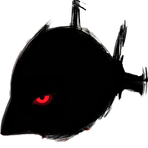 左寄せだと右側に文章が書ける。
- その6スマホ用スマホ用に調整。いずれにしてもスマホでは狭くて見づらいのであった。
@media screen and (max-width: 480px) {
/* タイムライン */
.timeline-item-content {
    width: calc(100% - -5px);/* 元はcalc(100% - 110px)*/
    padding: 0.45em 0.5em;/* 元は0.9em 1.0em */
    border-left: none;/* 消す */
	font-size: 90%;
}
}
ひとまずこんな感じで。